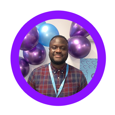
Joseph
“It’s a nice atmospheric change, the colours are really vibrant and sleek”
As a forward thinking business delivering bespoke, end to end, high performing revenue generation solutions with a vision for the future, we needed a brand to match.
Love at first sight
Enter Rawww, a design agency who worked with us to bring our new look to life. By listening to our thoughts, ideas and vision for the business, the team at Rawww began by focusing on combining our revised meaning for AT – ‘Accelerating Together’ – with our refreshed mission statement: gracefully delivering bespoke, end to end revenue generation solutions.

Jardel
“It’s nice to see the growth of the company and the new colours are really”
The end result? A sleek, modern new look that we fell in love with. The managers at ATM spoke for all the board when he said:
“It’s great to see where AT Management was, is and the direction it’s taking to encourage continued success.”
Directional Design
But before we launched it publicly, we wanted to introduce the whole team to it, to ensure everyone was happy and to get their feedback.
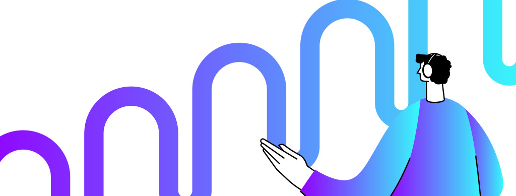
We love the varying shades of blue and flowing lines that represent the tech nature of the business, and that not all growth is linear, but rather, it flows, it adapts and it spreads in different directions, as and where it needs to. The illustrations that Rawww created are modern and fun, but with that necessary technical edge too, people looking ahead, thinking, growing and evolving. Everything combined perfectly reflecting the innovative, professional and performance led business we have grown into, as well as the direction they’re striving for in the future.
Mamadou
“Perception is key”
A Valentine’s Day Launch
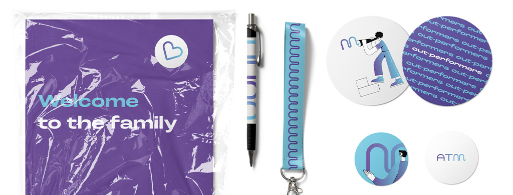
When we realised that the completion of our branding had come in time for Valentine’s Day we decided to launch it then… which was perfectly apt considering how much we loved the new branding! The launch was also supported by brand packs (pens, notebooks, coasters and ID tags etc.) created for all our AT Management employees alongside other launch material. The team at Rawww also incorporated the use of hearts (in brand colour) to reflect our love for the new look, and that tied in nicely with the day too!
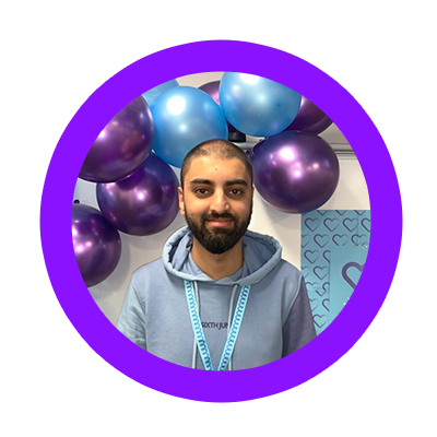
Amar
“No half measures here!”
The internal launch was a huge success; our people loved the new look and the brand packs went down well too! Here’s what a few of them had to say…

Saaliha
“ATM is helping me to become the AT JEM”
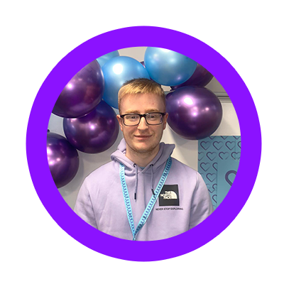
Nathan
“Positive changes equals positive minds”